
Boost Your Statistical Skills: Central Limit Theorem Demystified with Python!
Summary
A simplified explanation of CLT with Python demonstation

Data scientists often face the challenge of working with limited samples of data, yet they need to make meaningful inferences about larger populations based on these samples. This is where the Central Limit Theorem (CLT) comes into play as a fundamental concept.
In predictive modelling, Central Limit Theorem allows us to assume a normal distribution for errors or residuals, enabling the application of powerful techniques like linear regression, and time series analysis. And if you are wondering why the normal distribution arises so commonly (from the heights of students in a class to the lifetime of light bulbs), CLT is behind that as well.
Learning Objectives
In this article, we will first look at the formal definition of CLT followed by a simplified explanation with a real-life example. Finally, to make our understanding crystal clear, we will also verify this theorem on a synthetic dataset using Python code.
Before starting with CLT, we must understand the most popular distribution of all time: The Normal distribution.
What is normal distribution:
Normal or Gaussian distribution is a statistical pattern that often appears in various aspects of our everyday lives. If you plot the frequencies of a class full of students' heights, with height in feet on the x-axis and count of students on the y-axis, you would see a bell-shaped plot. That’s Normal Distribution. Very few students will be very short (left tapered edge), the majority will have a moderate height (peak in the middle), and again very few will be very tall (right tapered edge). It is also known as a bell curve because of its characteristic shape, resembling a symmetrical curve that peaks in the middle and tapers off towards the edges.

In a Normal distribution, the average, the median, and the mode (the most common value) are all the same and located at the peak of the curve. The curve is symmetric around this point, meaning that an equal number of values fall on both sides of the peak. As you move away from the peak, the number of values gradually decreases, forming the tapering edges of the curve.
Now that we know what is Normal Distribution, it will be a cakewalk going through the Central limit Theorem.
What is Central limit theorem?
Given a dataset with unknown distribution (it could be uniform, binomial or completely random), the sample means will approximate the normal distribution.
Central Limit Theorem: Simplified
Let’s break that down. Imagine we have the exam scores of a group of 100 students who took a very tough exam. If you draw a curve of their exam scores on a graph, the curve is likely to be skewed to the right. In this case, most students would have low test scores, and a smaller number of people would have high scores that skew the curve toward the right of the graph(chart below). this asymmetry tells that the scores are clearly not distributed Normally.


Notice the histogram on the right, it shows how the scores are distributed in a positively skewed manner.
Now the fun part, let’s take 30 scores from this chart randomly and calculate their average. We call it 1st sample mean.
Similarly, let’s take another set of 30 scores chosen randomly from this 100 and note down the average of those 30 scores (2nd sample mean)

Continue this process n times and we will end up having n such sample means.
Let’s plot the histogram of these n sample means. Histogram visualises how these sample means are distributed.
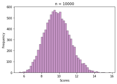
Central Limit Theorem says, if n is very high, it means if we keep on repeating this process for a long time, this histogram will form a bell-like shape. OR, In statistical terms, it will follow Normal distribution.
Correctly so, for n = 10000, we got this histogram by plotting the frequencies of the sample means.

What’s amazing about the CLT is that even if the original distribution of scores in the exam was weird or lopsided, the average scores of the samples is still following this symmetric normal distribution.
Now we are ready to answer this question:
Why is normal distribution found so commonly in nature and data?
In simpler terms, the CLT tells us that many natural phenomena are the result of numerous underlying factors working together. Each factor contributes a small amount to the overall outcome, and when these contributions are combined, their collective effect follows a normal distribution. This is why we often observe the normal distribution appearing in various aspects of our lives, as diverse phenomena can be seen as a sum or average of multiple independent factors.
Verifying CLT ( Using Exam Score data)
Now that the Theorem is clear to us, let us see how we can use Python to validate it.
I have loaded this data into a Jupyter Notebook. The following code selects a set of 30 scores randomly and calculates their average.
import pandas as pd
import random
import numpy as np

#reading data from csv
dt = pd.read_csv("score_data.csv")
score_vector = dt.Score

#selecting 30 scores randomly
sample1 = random.sample(set(score_vector), 30)

#calculating sample mean of First sample
np.mean(sample1)
Repeating the sampling n times and storing the sample means.
import pandas as pd
import random
import numpy as np
import matplotlib.pyplot as plt
import seaborn as sns

# Reading data from csv
dt = pd.read_csv("score_data.csv")
score_vector = dt.Score

# Setting the value of n
n = 10000

# Initialising list where sample means will be stored
ls = []
for i in range(0,n):

    #selecting 30 scores randomly
    sample1 = random.sample(set(score_vector), 30)

    #calculating sample mean of 30 scores and appending with the existing list
    ls = ls + [np.mean(sample1)]

# Plotting Histograms
sns.distplot(a=ls, color='purple', bins = 30,
             hist_kws={"edgecolor": 'black'})

# Adding title and axis names
plt.title('n = '+ str(n))
plt.xlabel('Scores')
plt.ylabel('Frequency')
plt.show()
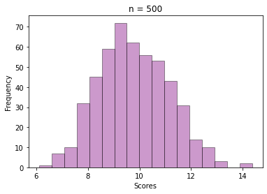
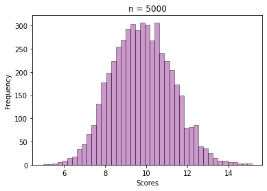
Output Histograms :
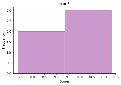
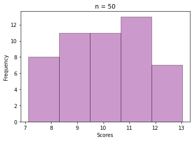
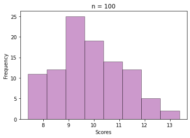
For n = 5, 20, 100, …, 50000
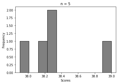
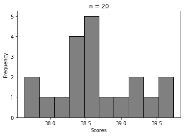
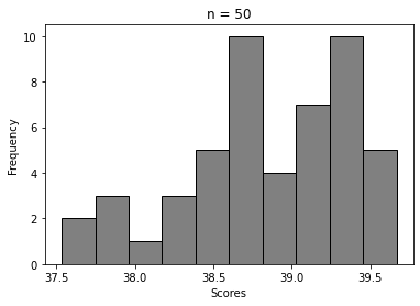
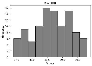
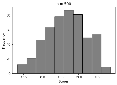
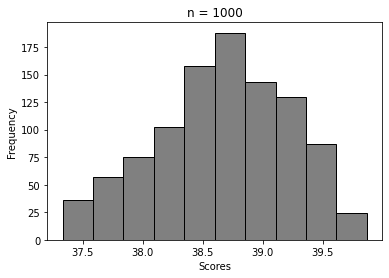
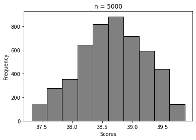
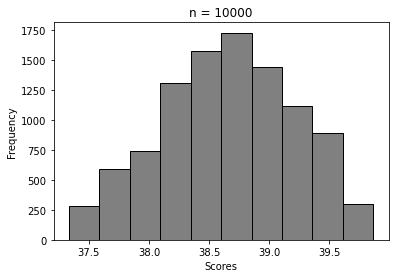
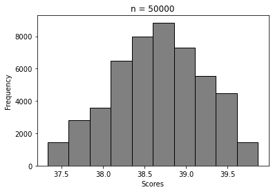
We can clearly see how the histogram tends to look more and more like Normal distribution’s. That’s Central Limit Theorem in action 🙂
Verifying CLT on synthetic data ( drawn Samples from a Poisson distribution)
Now we will draw samples from a distribution that is not symmetric/bell-shaped and show that the distribution of its sample means still converges to a Normal Distribution. For this exercise, I have chosen Gamma(a,b) distribution, where a and b are the shape and scale parameters. Gamma distribution is heavily skewed if the shape parameter is low.
We will draw 100 values from a Gamma(1,10) random variable. This is our base data (like 100 exam score data) for testing out CLT.
#Generating 100 samples from Gamma distribution
s = np.random.gamma(1, 10, 100)

# Display histogram of the sample:
sns.distplot(a=s, color='red',
             hist_kws={"edgecolor": 'black'})
plt.title('Gamma random Variable (Shape = 1, Scale = 50)')
Histogram :

As expected the values have formed a positively skewed histogram (the right tail is longer).
The next step is selecting a sample of size = 30 from those 100 values, and then calculating the mean. This way repeat the sampling n times and store all the sample means, like we did for the exam score data.
See how beautifully it converges to a bell-shaped plot, even though the values are sample means from a skewed Gamma distribution.
Conclusion
The Central Limit Theorem is like a superhero cape for statisticians, empowering us to draw robust conclusions and make confident predictions even in the face of complex data. It’s a fundamental concept that has revolutionized the world of statistics and plays a pivotal role in decision-making across various industries.
Let’s celebrate this extraordinary theorem that has shaped the way we understand and interpret data! If you’re fascinated by the power of statistics and want to learn more, drop a comment below or connect with me. I’m always excited to collaborate and dive into data-driven discussions 🙂
More content at PlainEnglish.io.
Sign up for our free weekly newsletter. Follow us on Twitter, LinkedIn, YouTube, and Discord.
Boost Your Statistical Skills: Central Limit Theorem Demystified with Python! was originally published in Artificial Intelligence in Plain English on Medium, where people are continuing the conversation by highlighting and responding to this story.
https://ai.plainenglish.io/boost-your-statistical-skills-central-limit-theorem-demystified-with-python-e26efb572232?source=rss—-78d064101951—4
By: Sarbari Roy
Title: Boost Your Statistical Skills: Central Limit Theorem Demystified with Python!
Sourced From: ai.plainenglish.io/boost-your-statistical-skills-central-limit-theorem-demystified-with-python-e26efb572232?source=rss—-78d064101951—4
Published Date: Mon, 05 Jun 2023 05:31:27 GMT
Did you miss our previous article…
https://e-bookreadercomparison.com/investing-in-the-future-openais-100000-grants-for-democratizing-ai/

